The Type and Spacing Token Kit
Put your spacing and type scales on one grid: snap the spacing, give every type step a line height on the grid, mark the large-text steps, give each color the smallest step it may set, and size every control from the tokens
CostUI's Spacing Scale Generator, Type Scale Generator and Contrast Checker each answer one question and never meet. The spacing tool's geometric mode prints 40.5 px and 60.75 px, off any grid; the type tool prints 27.65 px and no line height at all; and neither says which type steps count as large text, the number the Contrast Checker's pass and fail depend on. The kit puts them on one grid. In its example, 8 px times 1.5 snaps to 8, 12, 20, 28, 40, 60, 92 and 136 px on a 4 px grid, while a tight 4 px times 1.25 scale collides three times and ships five tokens. The minor third from 16 px becomes whole-pixel tokens from 11 to 40 px with line heights of 20 to 48 px on the grid; 28 px and up are large text, and 19 and 23 px only in bold. A link green at 4.4992:1 fails body text and may only set the 28 px step and up, or 19 px and up in bold; a 16 px button with 8 px padding is 40 px tall, over the 24 px WCAG 2.2 minimum and under the 44 px enhanced target, which 12 px of padding reaches. Every figure is computed from the site's own calculators; the scales, palette and controls are examples, and rules of thumb are called rules of thumb. It is not a full accessibility audit and not legal advice. Included: seven steps, a scale worksheet, a color-by-step grid, a target check sheet, a token sheet, reference tables for every ratio, a worked token sheet in CSS, a quickstart, and a personalised sheet worked from the numbers you enter in the calculators.
What’s inside
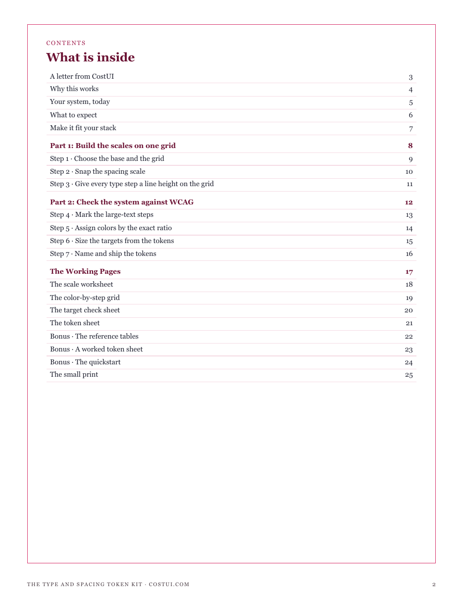
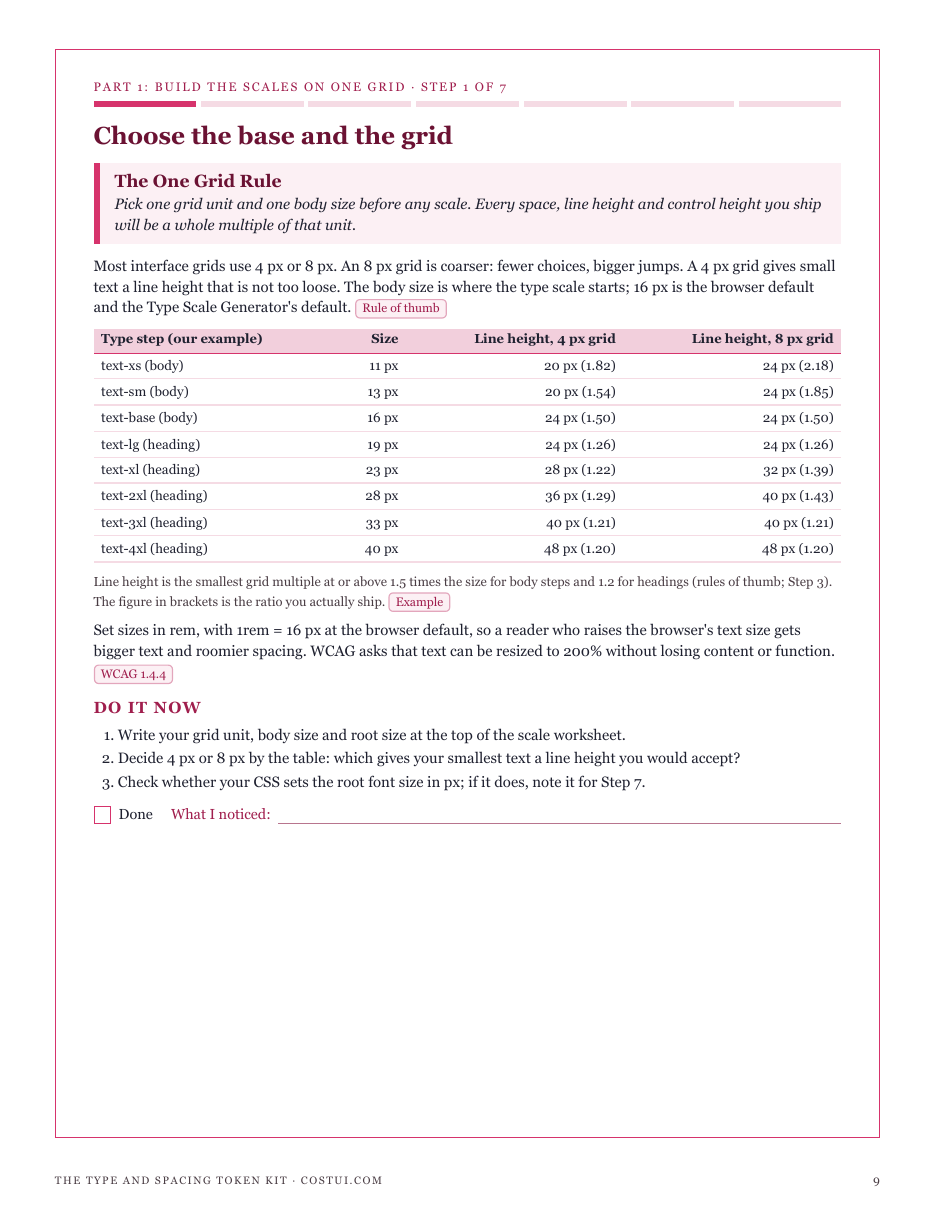
- The One Grid Rule: one grid unit and one body size before any scale, with line heights compared on 4 px and 8 px grids
- The Snap Rule: your spacing scale snapped to the grid, with the steps that collide once snapped dropped
- The Leading Rule: every type step a whole pixel, with the smallest line height on the grid at 1.5 (body) or 1.2 (headings)
- The Shipped Size Rule: which steps count as large text (24 px, or 18.67 px bold) and the contrast floor each needs
- The Exact Ratio Rule: each text color judged on its exact WCAG ratio, never rounded, with the smallest step it may set
- The Target Size Rule: controls built from tokens against 24 by 24 CSS px (2.5.8, AA) and 44 by 44 (2.5.5, AAA)
- The Position Name Rule: tokens named by position, shipped in rem, and tested at 200% text, 320 px and text-spacing overrides
- Four working pages: a scale worksheet, a color-by-step grid, a target check sheet and a token sheet
- Reference tables: every type ratio from 16 px as whole-pixel tokens, line heights on 4 and 8 px grids, and snapped linear scales
- A worked token sheet in CSS custom properties, a quickstart, and a personalised sheet from your own calculator inputs
Run one of the free calculators first and buy from that page, and this sheet is computed from your own figures. Buy from here and the pack still arrives complete — the sheet simply has no numbers of yours to work from yet.
14-day refund, no questions asked. If the pack is not what you needed, email support@graburl.com and we refund you in full — you do not have to justify it or delete the file. Full policy.
$19.00 including any taxes · PDF, 25 pages · instant download, link valid 7 days and 5 downloads.
Sold by GrabURL. The charge appears on your statement as GrabURL.
Refund policy · Terms of sale · support@graburl.com